|
Victor Moscoso is the stand-out illustrator/artist of the 1960's. He was taught by none other than Josef Albers from the Bauhaus school of art. He taught Moscoso about colour and he then went against all the 'fine art' rules. The work than Victor Moscoso came up with was completely different to anything else at that time. The writing was difficult to read and the colours were so vivid it looked like it was moving. This was so new and different to everything else and that is why I like his work. He famously said "Fuck this fine-art shit, man" and I am really on board with his way of thinking! If more people thought like him the world would be a better place!
0 Comments
This is a fashion editorial from Dazed & Confused in 2007 I believe. It stars Kate Moss and her boyfriend at the time, Pete Doherty. It was to advertise her collaboration with Topshop. The narrative intention in this editorial shoot is to sell clothes to us. She is one of the best known supermodels in the world and her target demographic would be similar if not the same as Topshop, so young 18-25 females that are interested in fashion, youth culture and photography. At the time of this shoot, her and Pete Doherty's passionate and volatile relationship was in the press quite frequently. They are taking advantage of their relationship being in the public eye and including him in the photoshoot despite the clothing collection not including mens clothing.
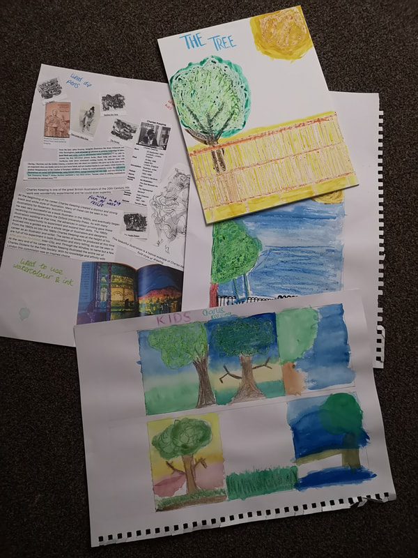
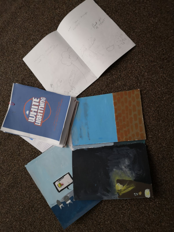
The location of the shoot seems to be a country house, very natural and airy; wooden furniture and seems quite upper class. This ties in well with her clothing range, lots of light airy tea dresses and simple statement pieces. All the images are in black and white, I think this is to make it look a bit retro, almost 1960's style. None of the clothing is particularly modern etc so it does work quite well. It feels as though it was shot in springtime and they have tried to make it happy and romantic, with the image of them lying down together and making it show them very much in love. The first image is a topless shot. Kate Moss has appeared topless before, and we can only assume that the reason she has done this is to grab our attention as opposed to advertising her clothes. There is very minimal typographic elements in these pictures. One paragraph on the second page explaining about the Topshop clothing range and talking to Kate Moss. The only other part is the overlaid typographics on the front double page saying "GIRL ON TOP" in very fine lettering. Overall, I think that the editorial images are fantastic and are more to show off the Kate Moss brand and lifestyle than her clothes in particular. She wants to sell herself as a brand, to make the people who buy the clothes feel like they're a supermodel too. This project was the final of the semester, and my favourite by far. As a naturally colourful person, I really enjoyed learning about it. Our first week we learned about the colour theory, how to mix paints and how to create different shades of a colour etc. After this we looked into typography and how that can affect a piece of work. We then had to design a book cover entitled 'The Tree' and do it in three different genres and in the style of three different artists. This was quite challenging but also a really good learning experience. The brief for the final part of this project was to illustrate a 12 page book based on a nursery rhyme. I did Humpty Dumpty and used a mixed media style of acrylic, digital drawing and digital collage. I was really proud of the idea and how I produced it but I ran out of time and ended up not being able to make the changes I wanted to. Overall though I think this is my strongest project so far and I feel that I've learned the most from this. This project was really intense. I think my ability to draw is probably my weakness, and the skill that needs improved the most so I was really happy to get into this project headfirst. We initially started with learning about basic perspective. I found this really informative and useful. It took a while to learn the rules about the different types of perspective, but I definitely feel a lot more confident and able to draw in perspective properly now. The second week we learned about more advanced perspective and practiced using it in our drawings and work. I enjoyed the freedom of using my new knowledge in my own ways. The brief for the 3rd week of this project was to create 40 full colour thumbnails, to teach us to get our ideas out into simple small sketches quickly, then to develop the strongest ideas into full pieces of work. We then had to choose a final three to finish completely and present professionally to Tony. I really enjoyed this project (although I probably didn't say that at the time!) and learned a lot from the feedback we had. Here are some images of American mid-century illustration that I find interesting and have been looking at. They depict normal and mundane scenes but have a lot of visual interest and I find myself staring at them for a long time without realising. The majority of these images are by Norman Rockwell, who was known for this style and for his idealised style of society.
This project nearly broke me!
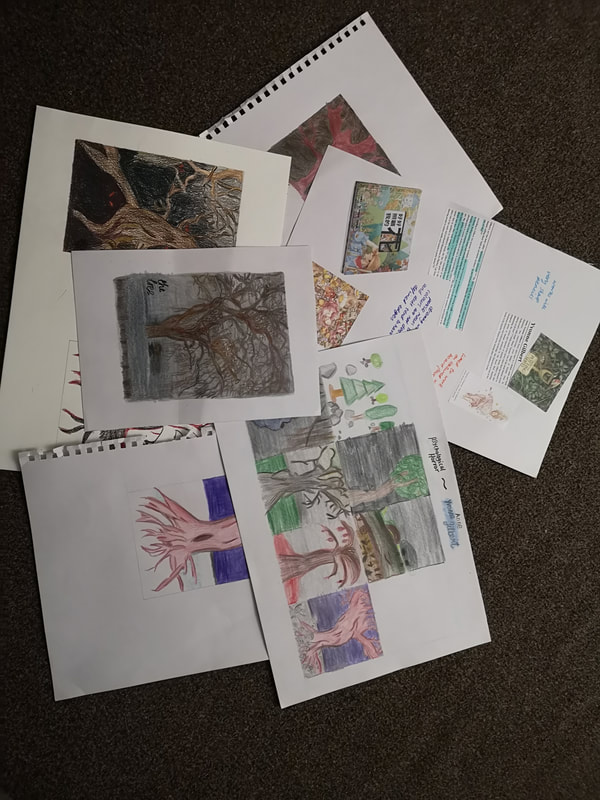
The first part of it involved doing 21 tasks. As a student with a disability and reduced feeling and movement in my fingers/hands, I was instantly worried reading the tasks we had to do. We did everything from building paper boxes (easier said than done!), creating our own sketchbooks and slicing paper with a scalpel. This sounds so simple, but using a scalpel with a metal ruler and cutting a straight line is damn near impossible!! After two weeks of these tasks, we were asked to copy three different pieces of art using the original artists' style. This was a really challenging idea but also really fun to do. It was three completely different types of media, scraperboard, dip pen and ink, and pencil. Project One.
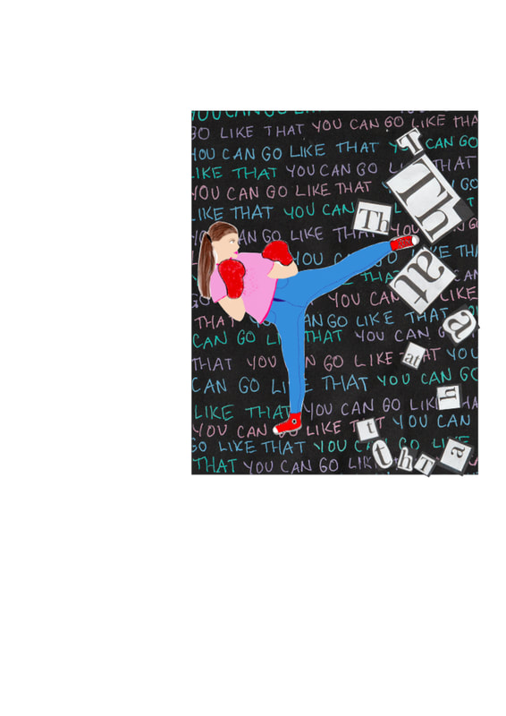
This was a toughie! We were well and truly thrown in at the deep end! Our first piece of work was printed and sold at the Keswick Comic Book Festival in October, so the pressure was on! We were all given a line from a song that had been translated into a few different languages then back into English so that they didn't make any sense at all! We were then asked to do a comic strip with a minimum of 5 panels. My phrase was "You can go like that". I really struggled to come up with ideas for this. It seemed like a very open phrase. I decided to separate it out into words and try to come up with one panel for each word. I decided to go ahead with a feminist type idea as I was worried about the timescale. The images above show my ideas and how I decided to put it together. Looking back now after doing a few more projects I can see all my mistakes. I didn't do enough thumbnails and explore different ideas and I think this really showed. I missed part of the project brief where it said that we had to keep the designs within the panels and I think, looking back, that my design really suffered because of it. I enjoyed the project but I know I could have done a lot better and would love the chance to do it again armed with the knowledge I have gained since the project. The first semester has certainly been a baptism of fire! We have learned so much and I decided to keep some of my notes on here. The lectures are really fascinating and I have been taking pages and pages of notes so that I can look back on them and look into them into more detail at a later date. Also partly because I'm old and not much seems to stay in my brain these days!
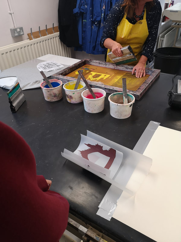
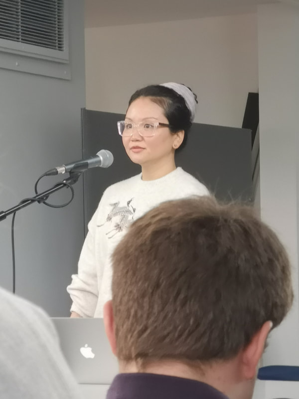
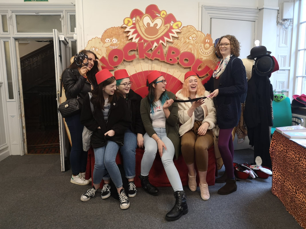
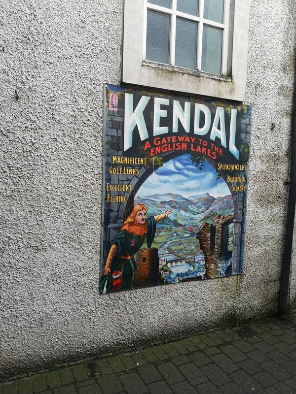
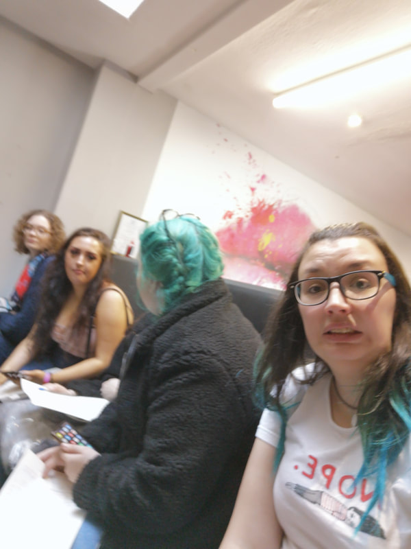
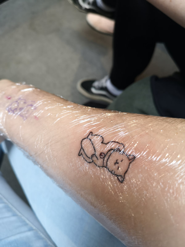
Modernism Modernism-a sustained period of innovation and expansion in the arts Mid 1800s-1970’s The name comes from the latin ‘modo’ meaning ‘just now’ Modernism is told as a meta narrative (one long story) and the story is told by figures in the field of cultural production such as artists, collectors, critics, historians) Seen as a route map-a sense of hierarchy and order -modernism was a quest for originality Cause and effect 1870-1920 enlightenment 1920-1960 high modernity 1960 onwards- modernism in dispute (post modernism) Pop art-fine art and commercial art together 1870-1920 Enlightenment -scientific discovery and enlightenment -idealism and belief in the ‘modern’ -visual culture as a mirror to contemporary life -artist as innovator (not preserver) experimentation with representation Modernism as determinism-accelerated change Darwin & Einstein’s works huge part of changes -innovation in the sciences, technology and industrial practices -context-grand political ideas and power strutures Modernism “What we produce is always ahead of what we think” –Marx Marx broke society into 2: -infrastructure-economic sphere of productive activity -superstructure-social activities Determinism: how scientific innovation, technological improvements affect the production of cultural texts Eiffel tower-designed and built for Worlds Fair in Paris-this was the first thing that gave the public an opportunity to see the world from above which was a huge development Edison-1879-invented the lightbulb 1905-theory of relativity- Einstein 1913- cars became available to everyone (that could afford them) Crisis of Representation? Old ways of portraying the world are no longer relevant How to depict-interaction-industrial/technological? Spatial displacement-how to capture time and space Modernism was a new pictorial language You were a good artist if you could create something realistically until Modernism 1889-worlds fair, Paris -eiffel tower built for it -art and technology presented side by side Monet-impressionists-painted the impressions of something at the time Seurat-batlers at Asnieres-painting normal people with an industrial scene in the background-showing the juxtaposition of both ways of life Pointillism-work made up from dots/points -mixed colours from primary colours, then placed colours next to each other then when you take a step back it almost looks like its moving Revolutionary-Paul Cezanne- Mon Saint-Victoire -believed all shapes in nature could be simplified into simple geometric shapes Picasso- Damoiselles de Avignon -analytical cubism-trying to look at all the different facets Synthetic cubism-collage Marcel Duchamp Edward Muybridge-photos of animals and people moving and captured the movements Robert Delauney-images of Eiffel tower Paris-very important place in terms of culture in late 18th century) Hierarchy and taste (…fields of cultural production etc) French-hated cubism-ugly-complete opposite of art nouveau Art nouveau was most popular at the time George Meleis-cinema primitives Milan Dynamism of modern life -famous for futurism-took all utopian ideas of travel/technology and incorporated it into their arts Futurists-Filippo Marinetti-first manifesto-he published in Parisian paper which caused uproar Umberto Boccioni-The city rises: first to combine human and technology, shows a city being born/a new age Futurists wanted you to be energised and motivated Antonio Sant Elia- New City : architectural drawings Bombardamento Aeroeo-Tullio crali Futurism- often surrounded by political agenda-supporters of Mussolini/hitler etc Modernism as ‘design for living’ “By changing the language of visual culture you affect modes of thought. By changing thought you change your life.” -Robert Hughes -Structuralism -form follows function (design and architecture) -utilitarian solutions/social utopia -belief that they can change how people think by design Moscow Constructivism -post Russian revolution (1917) first flush of communism-idealistic -filmmakers/artists/designers-messengers of the state. Used to create a visual identity for communism -rejected the western idea of the artist (bourgeious, capitalist construct) -word/images as agents of revolution Constructivist Poster Agitprop-agitation and propaganda -poster as mass communication Form -assertive, powerful -dynamic geometric layouts -invention under restraint (limited colour options/fonts/recycled materials etc) -some western influences (cubism) -heavy use of photography-power of the image-trusted medium-everyone believed it -film avant garde (anti-hollywood) Mainly black/red/white -gender neutral Rodchenko- Varvana Stepanova-lots of constructive works are anonymous -artists worked across many disciplines Russian film industry as huge and influential as Hollywood Steinberg Bros-‘Man with a movie camera’-revolutionary in how it uses cinematography-shows editing process -constructivism- ended with Stalin era -Social realism -lot of constructive artists fled from country when Stalin took over -Tower Bawher-Theodore Usher Japonism Ukiyo-e -began as a craze for collecting Japanese art -Van Gogh loved Japanese (Japanese lady)-he was amazed by Japanese art Edgar Degas-influenced by manga -influenced by the freedom and dynamic nature James Whistler (Oscar Wilde influenced by him)- models wearing Japanese costumes, looking at manga -paintings didn’t have a story etc Whistler-Nocturne:Blue & Gold (old Battersea bridge) Huntarian museum-Glasgow Leyland-had Whistler redecorate his house Ruskin is getting old and conservative Whistler’s work was hated by him and Whistler sued him for libel -claimed art should be treated like music not a way of learning Whistler established the idea that you didn’t need to spend weeks on paintings Didn’t agree with the theory of more time spent painting-better and more expensive He was charging for his time spent learning and honing his skill Liberty of London-icon of aesthetic movement -‘Queen Anne’ style architecture-outside of buildings-aesthetic movement EW Godwin-friend of Whistler Japonisme-book (Thames & Hudson) Before Japan, art was very religious and usually had a moral or religious belief behind -art wasn’t just art-it needed to teach you something The pre-raphaelites (artists that take inspiration from art that comes before Raphael) Rosetti-quintessential pre-Raphaelite, (1828-82) “The Girlhood of Mary Virgin’ History & Practice History of art and design (1850-1980)-modernist period -introduction to key movements and developments of contemporary art and design in modern era -explore ways of thinking about and understanding cultural works-graphic design, illustration etc Aims -inform creative practice -develop visual literacy -research -improve communication skills Hilary Mantel - ‘Evidence is always partial. Facts are not truth….” Rick Poyner- ‘Designers inevitably express the values of their day’ Cultural texts: -are created by individuals but are shaped and informed by the society around them -are not neutral in the values Can reflect: -beliefs and ideas -political ideaology -moral codes -representation -class and status -fears and concerns What does your clothing say about you? A piece of clothing is a cultural text. Semiotics-study of signs in society -anything capable of conveying meaning is a sign -make judgements of people before speaking -what we wear and how we present ourselves Function of clothes Disguise (visual disguise, protect from elements, can affect how the body moves) Social status, symbolic encoding Social status- Controlling devices (reflecting a system…) Role in society (outward display that denotes a persons age, social or gender role, career, religion etc) Status- help define power relations between people Subverting (social role-eg school uniforms)- wearing tie wrong, trainers etc, sign tshirts etc Symbolic encoding (eg colour and pattern) -a mode of communication creating unity and coherence, loaded with symbolic meaning-culturally significant -colours mean different things in different cultures Connotation of black -does it exist? Association with night and occult Existentialism-associated with mourning -symbolizes authority and experience (kuro in Japan) -subcultural appropriation -evil, dark side ‘bad guys’ Johnny Cash-known as the man in black Lost in translation-both wear black Personal expression -identity Expressive qualities Relation Engagement Dressing as pleasure Expresses alliegance -demonstrates and reflects bias, alliegances, view points and political alliegance Clothing as empowerment Signals a separation from the mainstream Casablanca-all wearing hats, outfits etc This is England-Shane Meadows 2011 riots-youth-branded tracksuits Clothes as cultural markers-culture in flux-can change over time -consumer culture-has a shelf life -global culture-corporate branding -context is important Cultural zeitgeist-look at footballers The Ramones-not punk music but attitude was very punk Look into book- No Logo by Naomi Klein Denim -long and complex history -seen as definite mode of casual dress -inferred individuality -the cut, brand and way they are worn can be powerful bearing significant meaning Functional garment-function over form -1870-1930’s -developed to be tough and durable for heavy physical work -popularised by American working class -synonymous with western mythology Competence & Influence -the two things we have to learn ourselves -10,000 hrs to achieve mastery in any field -natural talent isn’t important -Michael Turner-good artists for moving objects -need to learn to think about why you are drawing that way The art of Radio Times-good to look at to see the art of the day -work together and learn -draw from the shoulder -learn from the history of your client. Do your research! The Bauhaus & German modernism 1919-1933 Bauhaus (building-house in german) One of the worlds greatest art schools Walter Gropius-founder of Bauhaus Hannes Meyer-director 1928-1930 Ludwig Miesvan der Rohe 1930-33 Bauhaus Berlin 1932-33 Famous artists worked/studied there: Josef Hoffman Peter Keler Koloman Moser Friedrich Reimann Johannes Itten Joost Schmidt Oskar Schlemmer Wassily Kandinsky Josef Hartwig Hajo Rose Bauhaus movement-wide array of mediums, materials and disciplines -dominated European art throughout 20-30s -originated as a german school of the arts -morphed into its own modern art movement-unique approachable architecture and design -school was a hub for Europe’s experimental creatives Bauhaus schools: Weimar (1919-25), Dessau (1925-32), Berlin (1932-33) -eventually it closed due to the pressure from Nazi Germany before WWII outbreak -aim of the Bauhaus school was to bring art back into contact with everyday life -typically little ornamentation and focus on balanced forms and abstract shapes- (Wassily Kandinsky, Paul Klee, Marcel Breuer, Marianne Brandt all very into their abstract works) -Bauhaus architecture: harmoniously balanced geometric shapes and an emphasis on function -open plan, lots of glass -interiors-very open and simple Bauhaus influenced by arts and crafts movement in UK and Art Nouveau. Bauhaus-aimed to reunite fine art and functional design, creating practical objects with the soul of artworks. The school worked by this motto “…welcome any person of good repute, without regard to age or sex” although it was still typically middle class men that studied there and few women attended. Women of Bauhaus- Annie Albers, Marianne Brandt, Gertrud Arndt, Ilse Fehling, Alma Siedhoff-Buscher, Margarete Heymann, Lou Scheper-Berkenkamp Art Nouveau Inspired by geometry Charles Rennie Mackintosh (1868-1928) from Glasgow Not really understood and valued until after his death Viennese art scene was big fan of Mackintosh Art deco-influenced by Mackintosh Josef Hoffman-also influenced by Mackintosh American mid-century Illustration Post-war USA and UK were extremely different -UK was in a huge amount of debt after the war -USA however made a huge profit-huge boom, leading the way in popular culture USA- living in the future, atomic power, testing atomic stuff, tv was getting popular (obvs still very basic) youth culture/advertising etc was very much in its infancy-before then there was no teen culture -consumerism was rife -Norman Rockwell-1920's + illustrator, made a lot of money from Saturday Evening Post-millions of copies each week, he was almost a celebrity, illustrators were highly praised and highly paid -his style was an idealised image of society, he showed the 4 pillars of Roosevelt's America-freedom of fear, speech, want, religion -he had a great skill of managing to get a lot of narrative/story/points across to the audience in a single piece of work -'Rockwellian'-idealistic, quaint or sentimental portrayals of life -he used a lot of reference photography -eventually severed ties with Saturday Evening Post because he didn't agree with the rules about black people only allowed to be shown in a servitude manner. -Once away from the Post, he started to represent a more realistic image of USA, including an illustration of a 6yr old black girl being escorted to an all white school by FBI agents and having tomatoes thrown at her-this would never have been allowed in the Post -all magazines at this time were pretty and aimed at stereotypical housewives, nuclear family setup, very sexist and patriarchal -Esquire and GQ-only magazines for men -Illustration still more commonly used for advertising than photography -womens magazines had short stories with fantastic illustrations -illustrators then were part of the office and paid a lot more than the equivalent now -look at Bob Peake-film posters -look at 50/60s work for unusual illustrative styles, present day is much 'safer' Bernie Fuchs -he put a lot of care and attention into hands and face, but the legs etc were basic gesture drawings, he wanted the reader to 'read' their faces/expression/body language Robert McGinnis -sexist -uses photographs and projector to draw onto canvas -very James Bond-esque -bikini-clad women -well known for illustrating crime fiction book jackets -artist for Sean Connery's era of Bond posters Robert Weaver -Mark making, sketchy, uses things in front of main subject -does the first few paint washes then leaves it, less than most other illustrators "go find a construction site or excavation" when you're feeling uninspired. IE when the subject isn't exciting, push yourself and make it exciting This era was mainly a boys club but there were a handful of female illustrators although they were given family friendly/mum/childrens illustration jobs Barbara Bradley, Arpi Ermoyan-president of Illustrators Society, Lorraine Fox (colourful), Lucia Larner (very stylish women in her work) Brian Sanders -UK illustrator- one of the only ones to take on the popular US style -during filming of 2001 A space odyssey he was hired as onset illustrator -designed the poster/promotional work for season six of Mad Men 1970's New York -there was a rejection of the 'standard model' of design -NYC was the centre of advertising industry-Madison Avenue -Some popular names at the time- Saul Bass, Robert Brownjohn, Alvin Lustig, Otto Storch, Tom Geismar, George Lois, Gene Frederico, Paul Rand -Bill Burnbach-came up with the 'big apple' -more of a poisoned apple! City was broken-city on its knees, haemorrhaging money -Milton Glaser-came up with the I<3NY slogan -Tourism budget increased overnight due to the popularity of this-$400,000 to 4.3million overnight -NY had more of a commercialised style of nouveau frisco, it was more accessible to the general public-more controlled, type is more readable, mainstream audience lack of print quality being part of design -Milton Glaser- "Computers are to design as microwaves are to cooking". Push Pin Studios-created by Milton Glaser, Seymour Chwast, Edward Sorel, Reynold Ruffins -bold use of colour everywhere Seymour Chwast-designed lots of typefaces-a lot used by ITC -lot of colour trapping -Push Pin Studios- sent out bi monthly compendiums to their clients to show off their ideas and increase workload -equal amounts of entertainment and information -BIG magazine-look into Herb Lubalin -master of typography -popularised use of type as image -designed the American Typewriter typeface (still very popular today) -always worked on tracing paper -really simple but very different -designed Avant Garde typeface Avant Garde Magazine-upmarket version of San Fransisco and all its illegality, very outrageous at the time, quite political ligatures-where two characters are morphed together So on 23rd September 2019 I finally became an official university student at University of Cumbria. I feel like I've been waiting for this day for 20 years. Its the first time in my life that I know I'm doing the right thing for me and nothing will stop me from completing this degree. Having said that, the reality of being a mother and a full time student is a lot harder than I imagined it to be. Remembering to do all my work as well as the washing and emptying the dishwasher etc is harder than I imagined. Me time is almost non-existent, but that's true for most parents I think. Its a little easier now the workshops have eased off. The first 5 weeks of this semester we had induction workshops for different areas of art. This began with screen printing. As I have previously ran an etsy shop specialising in customising clothing and used heat transfer vinyl (HTV), I had heard a lot about screen printing and was really excited about it. We had a really fun time just learning something completely new to most of us. This is something I hope to start being able to do in my spare time and reopen up my etsy shop and start selling my illustrations as prints, clothing etc. Need to improve my technical drawing skills first though! After screen printing, we did linoprinting and etching. Linoprinting is quite enjoyable but I'm always worried I'm going to lose a finger and my attention to detail definitely needs working on. Another challenge I have is that my hands and fingers struggle with small details due to my health issues, so my Lino print wasn't quite as finished and attractive as I wanted it to be. I try not to let this bother me but it is quite frustrating when you have an image in your head and your hands just can't do what you want them to do. We also had a tour of the wood workshop and were given the choice of working in there or ceramics. The majority of our group chose ceramics and I really enjoyed being able to create something from scratch with only my hands. Hopefully it'll look okay after its been fired in the kiln. The first project, the comic book I really struggled with, I'm not a comic book reader myself so it was definitely out of my comfort zone. Once the project was done, we went to Kendal for the Comic Book festival. We also had a talk at the studio from an amazing artist/illustrator Junko Mizuno, who considering her work is quite confident and has an erotic side to it, was very quiet and shy. The group of us together decided to randomly get a tattoo to remember our first year at uni and we decided to do that at lunchtime in Kendal, the lovely Natalya drew a lovely little good luck cat (like the gold ones that are popular in the Far East) and we all got one together. The second project was paper play and manipulation. This was a bit more enjoyable, but I had trouble with keeping up with the tasks because of the kids school half term. I managed to get 90% of it all handed in after the half term though, so I don't think I did too bad. The project after that was about perspective, and basically, the beginning of how to draw from scratch, back to basics. This is really what I needed! It gave me a lot more confidence to try and although I got a few things wrong I have definitely seen an improvement in my work. Project 4, which I'm just at the end of the first week of, is really creative and fun. We made our own colour wheel and mixed paints as well as learning about the basics of InDesign, Illustrator and Photoshop by experimenting with typography. Overall, I'm absolutely loving the course and really like that no two days are the same and I never really know what to expect. I just wish real life would stop getting in the way of it though! I'll leave you to look through a few pictures of the first couple of months of uni.... Jilly x The Ulm School of Design was founded by three friends. Inge Scholl, Max Bill (former Bauhaus student) and Otl Aicher. Aicher first met Inge Scholl through her younger brother, Werner at the University of Munich where they were classmates. Inge's younger brother and sister, Hans and Sophie, were core members of the White Rose student resistance movement against Nazi Germany. They were unfortunately tried, found guilty of treason and killed by guillotine. Inge and other family members were also arrested and interrogated but eventually released without charge. Max Bill was a huge supporter of the belief that you didn't just need to learn one skill and he lived like this, being a notable graphic designer, product designer and so on. HfG Ulm was built on the ideas below. The belief was that all parts of art and design were connected, there was no specialism and they wanted all students to know about all types of art and design and the whole process of everything, from initial idea to final product or design.  The school initially was set up with financial assistance from America and Europe to help Germany recover from WWII. The school wanted to help design and create products that would work in the 'real world' and therefore worked with specific companies to do this. This also helped to introduce people to the new technology that was being invented, as many people were afraid of newer technology due to the use of it in the War.
However, Max Bill didn't like this integration between art and design and the industry. He didn't share the belief with the other founders that the designer was as equally important to the design process as the other people in that process, the school believed they were all equal and Max Bill eventually resigned in 1957 due to this. The Ulm idea of design was the design of a system rather than a single object. This was shown through many of the students work, such as Hans Roericht, who not only designed stackable cups, he designed the entire kitchenware range, the likes of which can still be seen in places like IKEA. Very simple designs, yet effective and space saving! The way both schools, Ulm & Bauhaus taught students was an emphasis on practical work taught by professional practising artists and this is still used in many art schools today. Otl Aicher himself, was a very well renowned graphic designer and typographer who was most well known for his work with the Munich 1972 Olympics and the very famous pictogram designs, which are still influential to the current day, with the use of his stick figure designs on public signage everywhere. He also famously designed his own font, which is still common today. The 'Rotis' font is still very popular and used across the world to this day. His friendship with Inge Scholl eventually led to them marrying in 1952. The school eventually closed due to 'family disagreements' and financial issues in 1963. His work is still so important today, even if most people don't know who he is. Every time people see a road sign, or use his font on their work. His work is very distinguishable and timeless, the images he designed for the Olympic Games still look as modern in 2019 as they did the year they were designed. |